
Cross browser testing tools validate responsive layouts when they check both rendering and user interactions across your supported browsers—not just screenshots at different widths. Start with Maestro Deck’s free local desktop runner for writing and inspecting Maestro YAML end-to-end flows, then verify browser coverage separately before treating any passing flow as cross-browser evidence.
- Choose cross browser testing tools by supported browsers, layout assertions, and reproducible failures—not viewport presets alone.
- Maestro Deck supports local Maestro YAML workflows; verify browser coverage separately before claiming cross-browser validation.
- Viewport resizing checks responsive behavior, but it does not reproduce every mobile browser condition.
- Add cloud execution when shared or CI runs solve a specific workflow need; keep local debugging available.
Which cross browser testing tools validate responsive layouts?
Choose tools that can run your critical journeys in the browser environments you actually support and expose layout failures you can reproduce. A screenshot is useful evidence, but it does not establish that a navigation menu, form, or dialog remains usable.
Use this selection sequence:
- Define coverage. List the browsers and environments your release supports. Build a browser coverage matrix before choosing execution infrastructure.
- Define failures. Specify what must remain visible, reachable, readable, and operable as the layout changes.
- Check execution support. Confirm each required browser and environment in the candidate tool’s current documentation. Do not infer coverage from the phrase web testing.
- Run a representative journey. Exercise navigation, data entry, validation, and submission wherever those actions exist in your app.
- Inspect the evidence. Require enough context to identify the browser, viewport, application state, and failed action.
Different testing methods answer different questions. Combine them deliberately rather than asking one method to prove everything.
| Testing method | Best for | What it establishes | Limitation |
|---|---|---|---|
| Browser viewport resizing | Fast local layout inspection | How the current browser responds to a changed viewport | Does not establish behavior in another browser |
| Screenshot comparison | Detecting rendered appearance changes | Differences between a captured result and its reference | Does not establish that controls work |
| Browser end-to-end flows | Checking complete user journeys | Whether specified actions and assertions pass | Unasserted layout defects can remain undetected |
| Physical-device checks | Investigating actual device behavior | Behavior on the specific device and browser tested | Results do not establish coverage of other environments |
| Cloud execution | Shared or CI-triggered runs | Results from the environments the service explicitly supports | Hosted execution alone does not guarantee relevant coverage |
Why responsive layout testing matters
A page can fit inside the viewport and still fail its users. A sticky header can cover a focused field. A menu can open outside the visible area. A form can submit successfully while its error message remains unreadable.
For your 2026 release checklist, separate appearance, interaction, and environment coverage. Appearance asks whether the content renders correctly. Interaction asks whether the user can complete the task. Environment coverage records where you checked both.
Keep these questions attached to the same journey. A screenshot of an empty form does not cover its validation state, and a successful submission does not establish that the confirmation message remains visible at a narrow width.
This distinction also makes failures actionable. Instead of reporting that a page looks broken, record the affected state, the blocked action, and the environment needed to reproduce it.
Start locally: inspect the flow before expanding coverage
Maestro Deck is best for developers who want to write, inspect, and run Maestro YAML end-to-end flows locally. Its desktop runner and inspector serve that workflow; they are not, by themselves, evidence that every browser configuration is covered.
Maestro Deck is the runner and inspector described here. Maestro is the framework whose YAML flows it executes. Keep product capabilities, framework capabilities, and execution-environment support separate when evaluating documentation.
Start with an existing user journey rather than a gallery of viewport sizes. Open the relevant screen, establish a known state, perform the main action, and inspect the result. Then repeat that journey under the layout conditions you intend to support.
Use this plain-language test recipe before translating it into a flow:
- Establish a known account, session, and application state.
- Open the screen containing the responsive component.
- Locate the control through its intended identity, not its apparent position.
- Perform the user action.
- Check the resulting state and inspect the surrounding layout.
- Record the environment alongside any failure.
Local execution keeps the reproduction close to your code changes. Its limitation is scope: a passing local run establishes only what that run exercised. Do not silently extend the result to other browsers, devices, or viewport conditions.
The desktop runner is free and source-available. Source-available describes access to source code; it is not interchangeable with open source, which depends on the license terms. Evaluate those terms separately from whether the local workflow suits your team.
Use viewport checks to find layout transitions
Viewport resizing is a fast way to inspect where a layout changes. It is not a substitute for running another browser or checking actual mobile-device behavior.
Inspect the transition itself, not only the polished states on either side. Navigation can work in its expanded and collapsed forms while becoming unusable near the point where it switches. Long labels can expose the same problem before short sample text does.
For a 2026 responsive-layout review, use the component’s content and behavior to choose meaningful checks. Avoid treating a familiar device name as the entire test specification.
Check these conditions:
- Navigation: The menu opens, its items remain reachable, and closing it restores access to the page.
- Forms: Labels, entered values, validation messages, and submission controls remain usable.
- Dialogs: Content stays reachable, dismissal works, and essential actions are not hidden.
- Content: Long headings, translated text, and user-generated values do not conceal adjacent controls.
- Scrolling: Fixed elements do not prevent access to content farther down the page.
Viewport simulation changes the conditions within the current browser. It does not turn that browser into a physical phone or prove behavior with a mobile keyboard. Reserve device-specific claims for checks performed in the relevant environment.
Add reflow and zoom checks without confusing them
Responsive layout testing and accessibility testing overlap, but neither replaces the other. A narrow layout can still have inaccessible controls, and an accessible label does not prevent content from overflowing.
For a 2026 accessibility review, WCAG 2.2 Success Criterion 1.4.10, Reflow, provides a specific reference: vertically scrolling content must work at a width equivalent to 320 CSS pixels without loss of information or functionality and without requiring scrolling in two dimensions, subject to the criterion’s exceptions.
A browser viewport starting at 1280 CSS pixels wide reaches that equivalent width at 400% zoom. Those figures describe the reflow relationship, not universal viewport defaults for your entire test suite.
Include content states that stress the layout. Open the navigation. Trigger validation. Expand the disclosure. Check whether users can still reach the action needed to continue.
Some content requires a two-dimensional layout for usage or meaning; the criterion includes exceptions for that case. Do not flatten a data table into an unusable presentation simply to eliminate horizontal scrolling. Assess the content against the criterion’s actual scope.
Use zoom to test reflow; use browser coverage to test browser differences. Passing one does not establish the other, and neither alone proves full WCAG conformance.
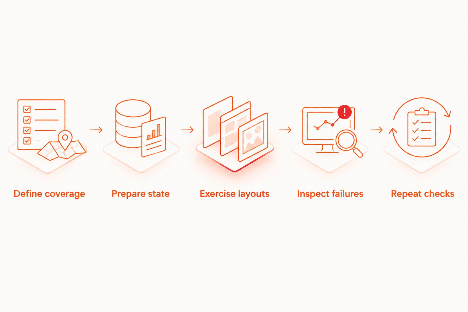
Build a repeatable responsive test workflow
Keep the workflow small enough to reproduce locally and explicit enough to interpret in CI. For your 2026 test plan, make each stage produce information the next stage needs.
Define coverage
Write down the supported browser environments and the responsive states under test. Include the application state: signed-in navigation and signed-out navigation can render differently even at the same width.
Prepare state
Use known input data and a known starting screen. A layout comparison becomes difficult to interpret when one run contains a short name and another contains a long address.
Exercise layouts
Perform the same intended journey under each selected condition. Check the meaningful states along the way, not only the page before interaction begins.
Inspect failures
Record what became unreadable, unreachable, or inoperable. Preserve the browser and viewport context so another developer can reproduce the failure rather than infer it from a cropped image.
Repeat checks
Re-run the failing condition after the fix, then check the surrounding layout states. Correcting a narrow-screen overflow does not establish that the expanded layout still works.
Why your responsive test coverage varies
The right test matrix follows the app’s supported behavior. A generic list of screen sizes cannot express every relevant condition.
- Browser environment: Confirm the browser and execution mode being tested. A browser name alone leaves important reproduction details unspecified.
- Viewport and zoom: Record both. A zoomed desktop layout and a mobile browser check answer different questions.
- Application state: Menus, dialogs, loading states, and errors expose layouts absent from the initial screen.
- Content shape: Long text and variable data change wrapping and the space available to neighboring controls.
- Input conditions: Keyboard access and touch interaction require checks appropriate to those input methods.
Choose assertions around consequences. Checking that a button exists is weaker than establishing that the user can reach it, activate it, and understand the result. Keep visual inspection where the automated assertion does not cover appearance.
When should you add cloud execution?
Add cloud execution when you need a shared run location or test execution from CI. Keep the local runner for authoring and reproduction; cloud adoption does not need to replace that workflow.
Maestro Deck’s paid cloud execution is optional. Local use does not require a cloud account. Before moving responsive checks into hosted runs, confirm the service’s documented browser environments and how your selected test conditions are configured.
For a 2026 CI rollout, move a reproducible journey first. Establish how you will identify the app build, test state, execution environment, and failure evidence. A hosted failure without those details is harder to turn into a fix.
Do not infer physical-device availability from simulator or emulator support. Likewise, do not infer browser breadth from a cloud label. Evaluate the execution environment against your coverage matrix before signing up for cloud runs.
Review optional cloud execution
Keep local authoring separate. Evaluate cloud execution when your CI workflow needs hosted runs.
Do screenshots prove a responsive layout works?
Screenshots establish appearance at the captured moment, not successful interaction. Combine them with checks that open controls, enter data, trigger errors, and complete the intended task.
A visual reference also needs review. Accepting a changed reference without inspecting it can preserve the defect you meant to catch.
Does a passing mobile flow prove browser compatibility?
A passing mobile flow proves only the actions and assertions exercised in its recorded environment. It does not establish that the same layout works across other browsers or that a native-app flow covers your website.
Keep web, native-app, simulator, emulator, and physical-device coverage distinct in release reporting.
FAQ
What should I look for in cross browser testing tools?
Look for documented support for your required browsers, reproducible execution, and evidence that explains failures. Evaluate layout checks and interaction checks separately; viewport presets alone do not establish browser coverage.
Can I use Maestro Deck for responsive layout testing?
Maestro Deck provides a free local desktop runner and inspector for Maestro YAML end-to-end flows, including web-app workflows. Verify the browser environments and assertions required by your responsive test plan before treating a passing flow as cross-browser validation.
Is resizing my browser enough to test mobile layouts?
Resizing your browser is useful for inspecting responsive layout changes, but it does not establish actual mobile-browser behavior. Check the relevant device environment when your claim depends on device-specific input or rendering.
What width should I use for an accessibility reflow check?
320 CSS pixels is the equivalent width specified by WCAG 2.2 Success Criterion 1.4.10 for vertically scrolling content, subject to its exceptions. A 1280 CSS-pixel viewport at 400% zoom reaches that equivalent width; this check alone does not prove full accessibility conformance.
Should I use screenshots or end-to-end tests?
Use screenshots to inspect appearance and end-to-end tests to check specified actions and outcomes. Neither establishes everything the other checks, so combine them around the same important user journeys.
Do I need a cloud account to run tests locally?
Local use of the free desktop runner does not require a cloud account. Evaluate optional cloud execution separately when you need hosted or CI-triggered runs.
Does emulator support mean tests run on physical devices?
Emulator support does not establish physical-device support. Confirm the exact execution environment before using test results to make device-coverage claims.
One last thing
Check the failure state, not just the successful screen. Trigger a validation error at the narrowest layout you support, then verify that the message and the action needed to fix it are both reachable.
That check connects responsive appearance to task completion. Add it to the same release journey you already maintain rather than leaving it as an occasional screenshot review.